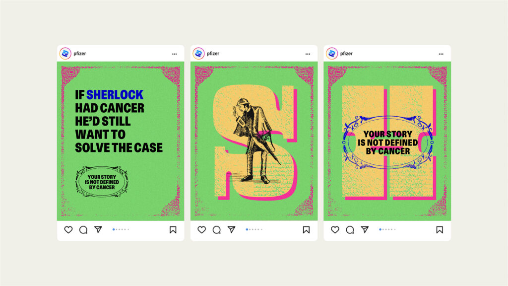
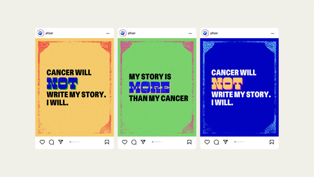
Cancer is often seen as a final, defining chapter. The campaign aimed to shift this view – portraying it as just one part of a larger story.
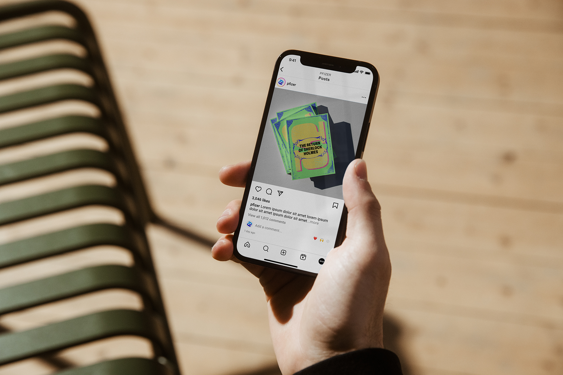
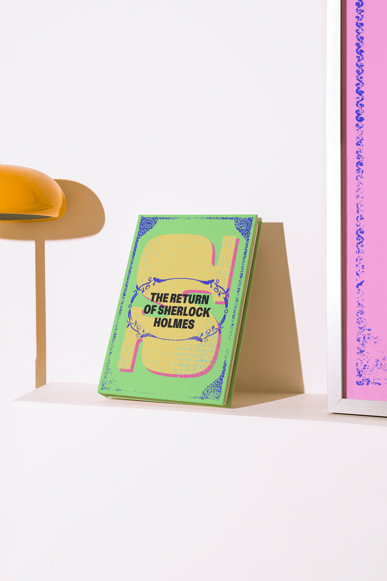
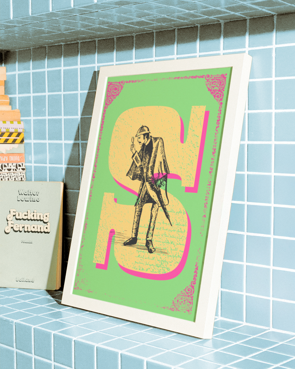
Drawing from Corita Kent’s bold aesthetic, we combined serigraphy, lithography, and old books. Electric colours contrasted with vintage textures, creating a modern yet grounded visual language.
The campaign struck a global chord, reframing cancer through a lens of resilience and continuity. Artful storytelling made the message emotionally powerful and widely memorable.